Apex: Real Estate Branding Project

Services
Brand Strategy
Brand Identity
Client
Apex
Location
Pakistan
Year
2026
Info
Defined by structural integrity and modern minimalism, this project represents the APEX of urban living. Every angle has been calculated for maximum light and flow, merging high-design aesthetics with functional precision. This isn't just a residence; it is a curated environment designed for those who demand excellence in every square foot.


Case Study
The Challenge
The real estate industry is heavily saturated with predictable visual tropes—primarily generic rooflines and standard architectural icons. APEX Real Estate approached me with a clear mandate: they needed a brand identity that communicated the foundational concept of "home" while simultaneously projecting immense strength, market leadership, and forward momentum. They required a visual system that could scale effortlessly from a digital avatar to a towering highway billboard without losing its impact.
The Solution
I decided to bypass cliché iconography entirely, opting instead for a highly customized, typographic approach. My goal was to engineer a wordmark that did the heavy lifting on its own, utilizing clever negative space to tell the brand's story in a fraction of a second.
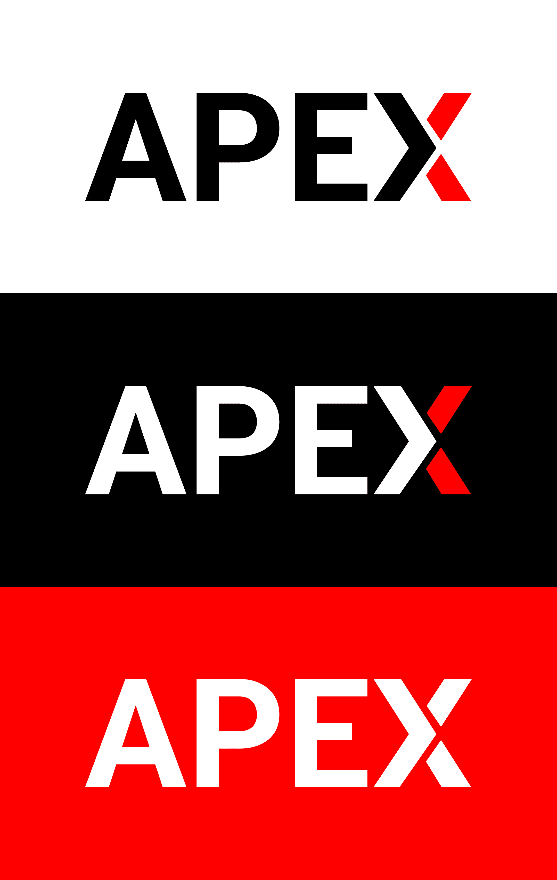
Concept Anatomy: The Power of Negative Space
The brilliance of the APEX identity lies in the deliberate intersection of the letters "E" and "X".
The Hidden Home: By carefully adjusting the kerning and geometry between the "E" and the "X", the resulting negative space forms the undeniable silhouette of a house. This anchors the brand firmly in the real estate sector without relying on an external, detached logo mark.
The Forward Arrow: The rightward-facing structure of the "X" is emphasized to double as an arrow. This geometric choice represents the literal definition of an "Apex"—the highest point—while communicating strength, power, and forward-thinking investment.
Visual System & Typography
Typography: I utilized a heavy, brutalist sans-serif typeface to establish an immediate sense of structural integrity and stability—qualities essential for a trusted real estate firm.
Color Palette: The primary palette relies on stark, confident contrast: Deep Charcoal/Black and Crisp White. To ensure the brand cuts through the noise of urban environments, I introduced a highly saturated Apex Red to draw the eye directly to the hidden arrow/home concept. A secondary vibrant Cyan is utilized for specific high-impact campaigns, offering versatility across different market segments.
Brand Application
The APEX identity was designed for maximum environmental dominance. As shown in the mockups, the bold, high-contrast nature of the wordmark allows it to integrate seamlessly into modern architectural spaces.
Environmental Signage: The stark white and red typography against raw concrete textures commands authority.
Outdoor Advertising: On highway billboards, the strong diagonal lines of the brand's graphic elements create a sense of speed and scale, ensuring legibility even at 70 mph.
The Result
The new APEX Real Estate identity is more than a logo; it is a strategic asset. By embedding the core industry symbol within a powerful typographic structure, I delivered a brand identity that is instantly recognizable, intellectually engaging, and undeniably authoritative.

